Customer Churn Analytics Dashboard
End-to-end analytics pipeline and executive dashboard for analyzing customer churn for a subscription-based telecom service. Uses the Telco Customer Churn dataset with a SQL → R → Tableau stack: raw data modeled and cleaned in SQL, transformed and aggregated in R, and visualized in a Tableau dashboard for churn patterns, high-risk segments, and revenue at risk.
Preview
Problem & Context
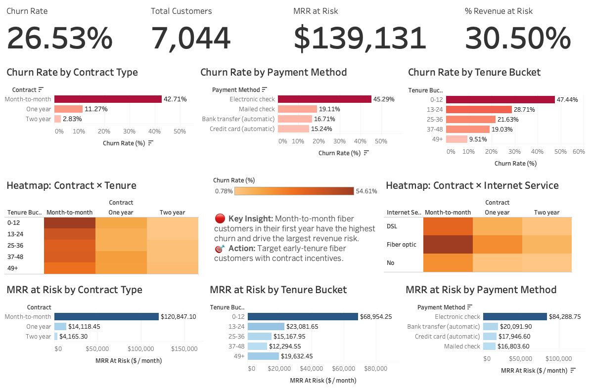
The goal was to build a reproducible analytics pipeline from raw Telco churn data to dashboard-ready outputs, identify churn patterns and high-risk segments (contract type, tenure, services), quantify revenue at risk (MRR from churned or at-risk customers), and deliver an executive-facing Tableau dashboard with clear KPIs and actionable insights. The pipeline separates ingest (SQL), transform (R), and visualize (Tableau) for maintainability.
What It Does
- SQL layer — Staging tables, cleaning and normalization, KPI views for churn rate and revenue at risk
- R layer — Extract from SQLite, build KPI and driver tables, export CSVs for Tableau (DBI, RSQLite, dplyr, tidyr, readr)
- Tableau dashboard — KPI summary, churn by segment (contract, tenure, internet, payment), Contract × Tenure and Contract × Internet heatmaps, MRR at risk views
- Documentation — report.md for methodology and reproducibility
Tech Stack
Key Takeaways
Combining SQL for modeling and cleaning, R for aggregation and export, and Tableau for storytelling produces a clear path from raw data to executive-ready insights. The dashboard answers which segments churn most and where revenue is at risk.